Background: A patient typically encounters countless new faces during their hospital stay, particularly at a teaching hospital. Often, patients may not know who they’ve interacted with, due to the overwhelming amount of new information. They might ask the wrong person about discharge, or recount an important conversation but not be able to identify who they spoke to. This can lead to frustration, poor patient experience, and inefficiencies. Factors contributing to this problem include multiple staff interactions, limited understanding of provider roles, and lack of tools to help patients keep track of their care team.
Purpose: We designed an infographic that visually represents various healthcare roles in a teaching hospital (e.g. primary teams, consulting teams, case managers, physical therapists, residents), aiming to enhance patients’ clarity about who is part of their care team. Our primary aim was to assess whether the infographic improved the patient’s ability to identify providers by role, and their satisfaction with the interactions.
Description: A single center pilot study was conducted with 45 patients admitted to a large urban academic medical center between February 2024 and August 2024. Inclusion criteria required that they read and write English fluently to participate, as our infographic is currently only in English. They also must be alert and oriented and have the capacity to make their own medical decisions in order to ensure that they could properly understand the materials. Patients were first given a pre-survey to identify their base knowledge of the various healthcare roles. They were then introduced to the infographic. Immediately after, they were given the post-survey to identify any improvements in knowledge. The pre- and post-surveys were identical to each other, except that the post-survey had two additional questions which asked the patient to rate the infographic’s effectiveness, as well as provide open-ended feedback.
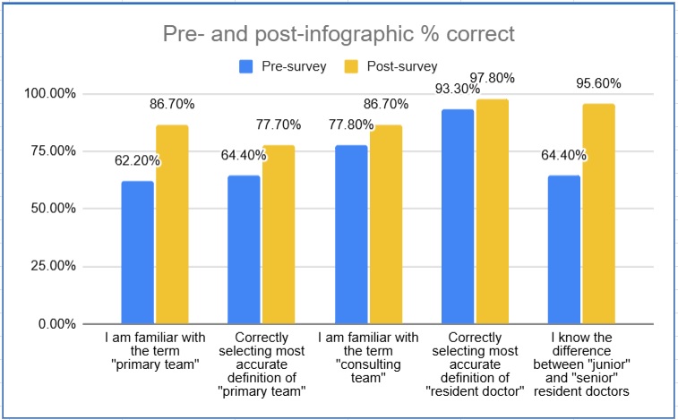
Conclusions: The visual infographic aid greatly improved patients’ understanding of healthcare team roles, with survey scores increasing by 15.8% (20.5% relative improvement) to an average post-survey score of 93.1%. Patients showed improvement in comprehension of care team roles, with understanding of the “primary team” rising from 62.2% to 86.7%. Patients also reported increased subjective comfort in identifying team members, with scores improving from an average of 6.7 to 7.6 when rated on a scale of 1 to 10. 84.4% of patients found the infographic helpful, reinforcing its value as a communication tool in the hospital setting. Some patients recommended distributing the infographic earlier in admission due to how helpful the tool was. Based on patient feedback, next steps to further improve patient satisfaction and understanding include adding roles like nutritionists and phlebotomists and providing an additional field for patients’ care plans.