Background: Data dashboards are used in many industries to track performance, however their development and efficacy in hospital medicine has not been well described. Data availability, provider attribution, feedback timeliness, and data accuracy have been cited as barriers to developing and implementing an effective performance dashboard.
Purpose: We developed a hospital medicine clinical data dashboard for use in our large academic hospital medicine division, and designed it to be visually appealing, intuitive to use, and containing timely, specific, and relevant clinical data.
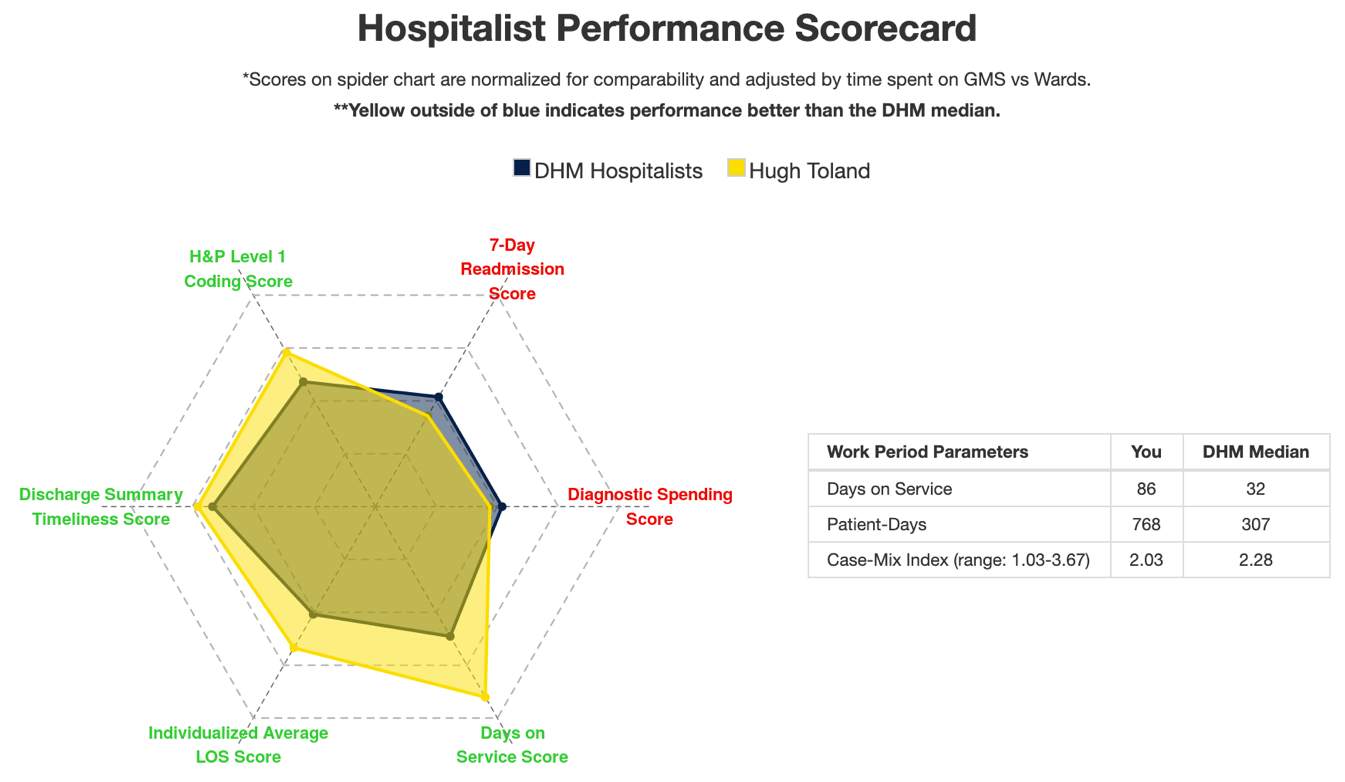
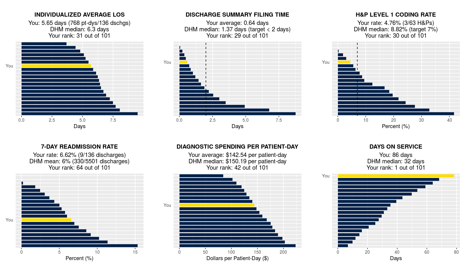
Description: Dashboard DevelopmentWe developed the dashboard using RStudio and visually patterned it after a radar graph dashboard from Johns Hopkins. The opening page of the dashboard displays individual metrics and normalized scores on a single graphical interface (Figure 1). Subsequent pages allow the hospitalists to drill down further into their individual data.Data implementationData is automatically extracted on a quarterly basis from Clarity, Epic’s clinical data warehouse, as well as from Amion.com, an online scheduling website used by the hospitalist group. Custom SQL queries were written for each metric, and an R script was also developed to communicate with Amion’s API. Hospitalists can access the dashboard using their chosen web browser and a unique password.MetricsQuality improvement leaders in our group selected 5 metrics as initial domains for the dashboard (Figure 1 and 2). The metrics were selected based on their clinical relevance and alignment with divisional and health system priorities. They are designed to be attributable to a single hospitalist and are adapted to the inpatient environment where multiple physicians often participate in a single encounter. Physicians can see their own scores, with breakdowns by service and trends over time on separate tabs. They can also see how their performance compares to their peers and the division average (Figure 2). Lastly, physicians can track the number of days they worked, the number of patients they cared for, and the average Case Mix Index of their patients, an indicator of severity of illness. PilotTo engage hospitalists in the development of the dashboard, and to explore attitudes and opinions towards individual data feedback, we invited 21 hospitalists in the group to participate in a monthly pilot, where they are given access to the dashboard and their individual results, and provide feedback on topics ranging from dashboard design, metric selection, and feedback delivery. In a pre-pilot survey, 21/21 (100%) hospitalists reported wanting metrics that focused on clinical performance and patient care. The leading concern expressed by surveyed hospitalists was that the metrics would not reflect true clinical competency (17/21, 81%), followed by concern about inaccurate attribution (14/21, 67%).
Conclusions: We developed an individual hospitalist clinical dashboard with an intuitive and visually appealing interface, automated data extraction, timely updates, and accurate provider attribution, populated with metrics relevant to practicing hospitalists. We engaged end users in its development to make it a tool relevant and useful to clinical practice. Revision or addition of other metrics can easily be incorporated into this dashboard.