
Background: Adverse events (AEs) are a major concern in the inpatient setting, with many considered preventable. The Patient Safety Learning Lab implemented a Patient Safety Dashboard integrated with our electronic health record as part of a suite of health information technology tools to reduce inpatient AEs. The goals of this evaluation were to understand patterns of Dashboard use and evaluate perceived usability by clinicians.
Methods: The Dashboard was implemented as part of a stepped-wedge randomized trial on neurology, oncology, and general medicine units at a large academic medical center from December 2016 through May 2018. A representative one-week period of the study was analyzed as a “deep dive” about typical Dashboard usage, including whether users logged in to the unit view, selected a patient detail, and opened or acknowledged a red or yellow flag (indicating action needed or a high-risk state, respectively). We categorized the times of day of Dashboard use into 3 categories: before (12:00AM-8:30AM), during (8:30AM-11:30AM) and after (11:30AM-12:00AM) rounds. Providers’ perceptions of the Dashboard were measured using the Health Information Technology Usability Evaluation Scale (Health-ITUES). Results are presented descriptively.
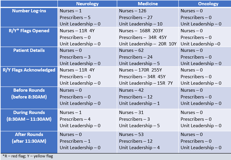
Results: The Dashboard was used at least once on 382 of 587 intervention days. Use of the Dashboard varied by role, service, and time of day. During the one-week deep dive, the dashboard was opened 169 times (Table 1). The majority of logins were by nurses on medicine units viewing patient details and for red/yellow flags. The dashboard was opened on neurology units mostly during interdisciplinary rounds by a physician assistant and was never opened on oncology units during that week. On medicine units, the dashboard was frequently opened by nurses across all 6 units, however, prescribers only opened the tool on 4 of these units, with unit leadership viewing it on the other 2 units. Responses to Health-ITUES showed moderate perceived usability, with scores generally in the 3-4 range on a 5-point scale (Table 2). Perceptions of the tool were highest for the measure of Perceived ease of use and lowest for Quality of work life. Attending physicians rated the tool highest compared to nurses, physician assistants, and residents.
Conclusions: Use of the Patient Safety Dashboard varied by provider role, service, and time of day. The results of this analysis are being used to generate lessons for increasing use and perceived usability for a new “productized” version of the Dashboard to be implemented throughout our hospital and our affiliated community hospital.
.png)